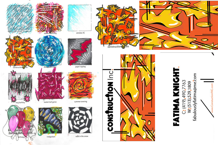
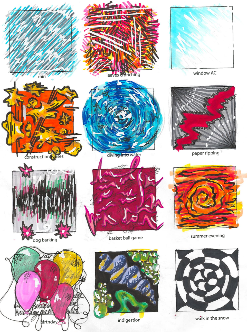
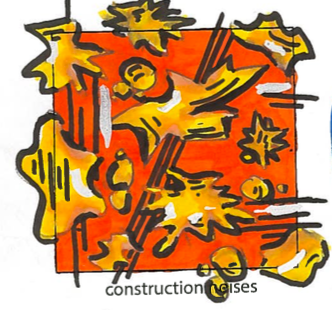
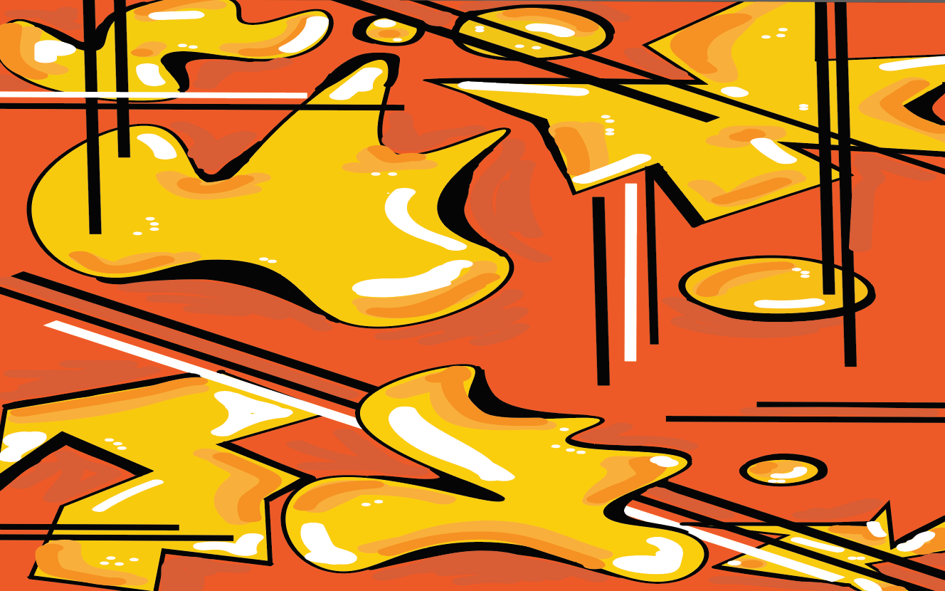
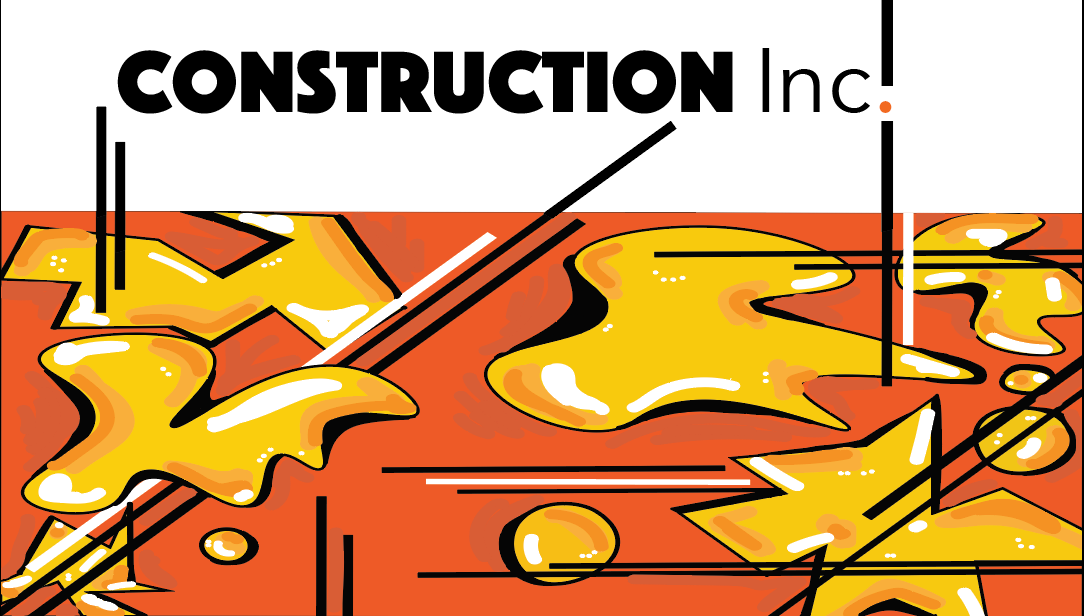
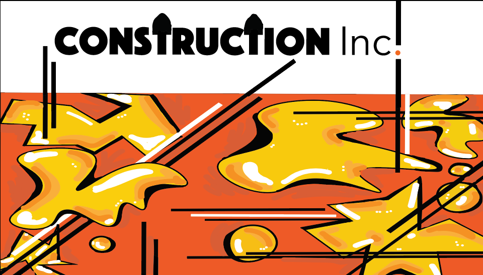
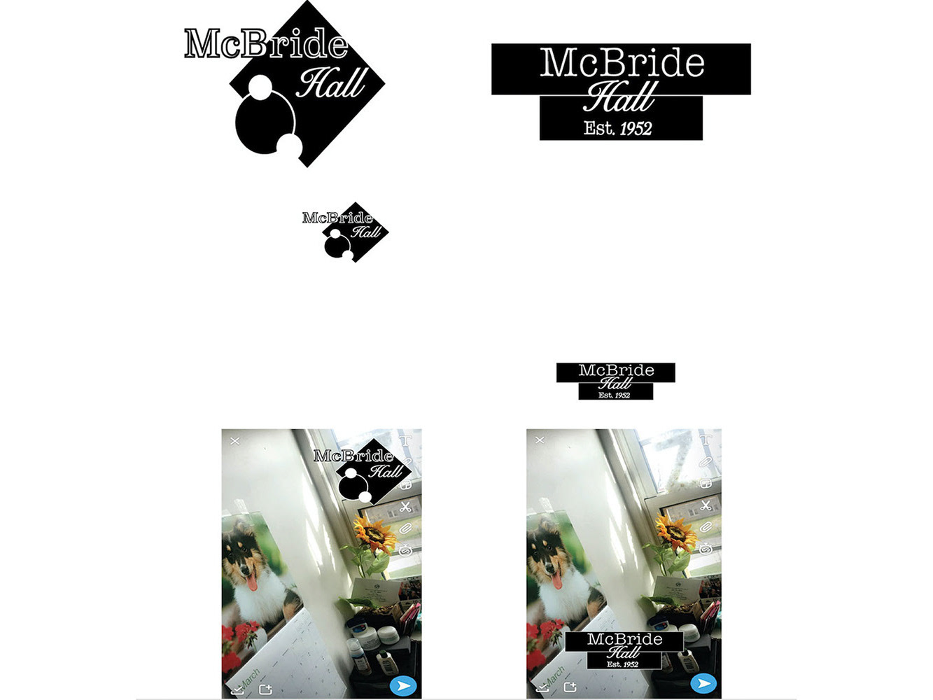
This submission was from one of the design assignments I had in Art 111 class. This was one of my favorite design problem, and i feel it contains some of my best work. The assignment was to visualize sounds. I had a lot of positive feedback on this project and wanted to explore some more on my own so I decided to continue with it. I took the design i did for "Construction Noises" because I wanted to do something in visual communications with it. Using the dominant colors of construction drawing being saturated yellow, orange, black I felt both offered both attention grabbing colors and are colors often associated with a construction site (yellow hard hats, orange cones, black stripes etc..), and would really give the clients or customers a visual aesthetic. I then developed shapes that represent the agonizing sound of construction (jackhammers, nailguns, hammers etc..) almost everyone in the world has heard.
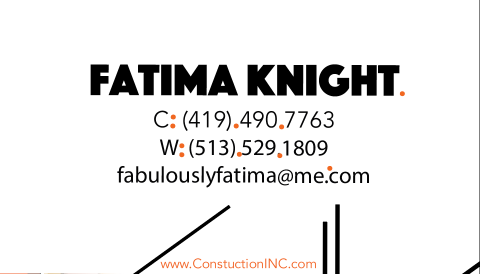
I then made a digital representation of the original, hand drawn design and from that I created a variety of business card templates using Adobe Illustrator. I created this with super clean lines and fonts. In one version i created shovels out of the T's(not sure it worked), giving it an iconic symbol reinforcing the idea of "construction". I also decided to use clean Serif style font with important words larger and bolder than those of the Arial. After I finished with my typography section, I experimented making the illustration a part of the white space while stretching out the lines; to build a relationship throughout the card, front to back.
PS - Spelling errors in the domain and I drew the shovels with my trackpad