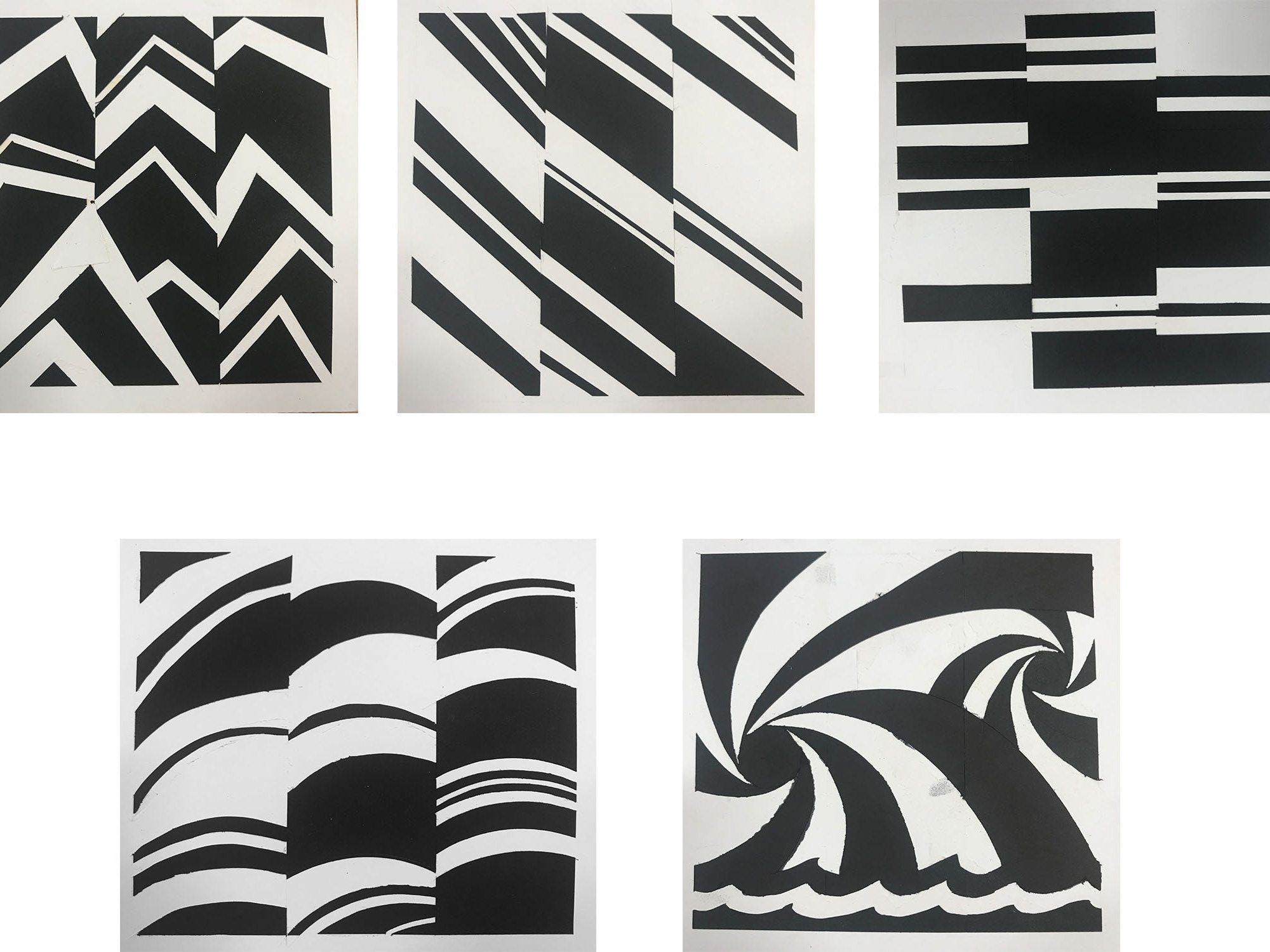
Art 102: Still Life
Professor: Tracy Featherstone
Created with blends of green, violet, and orange.
Photos:
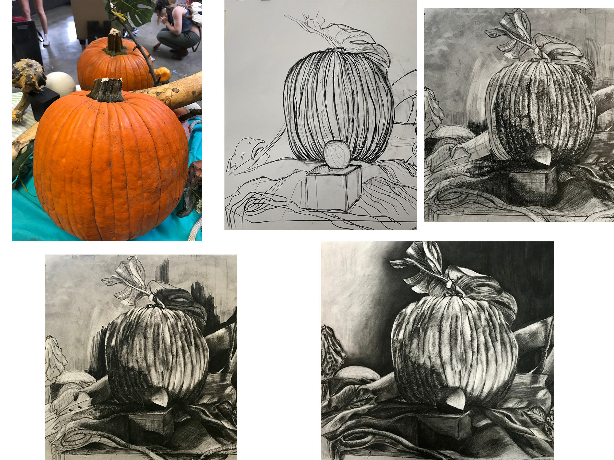
Decided to narrow it down to two photos with great perspective and color; however, the color saturation and values on the first photo weren't compositionally do-able. Which is why I chose the second photo, a still life that my professor put together.
Value matching:
I edited the photo to Black and White so I could easily evaluate the values, contrast, and hues and used for future reference use.
Outlining, Preliminary final:
I then traced on tracing paper to get the correct proportions. Later I defined all the values in black and white from the value scale (1-9) and labeled them with corresponding numbers. After that, I matched the saturation of the hues to the grey tones to create a preliminary sketch.
Finally at the critique, Professor Featherstone told me to crop out the cup since it was bright white and because it didn't compositionally fit in the space.
Final:
Below is the final result which includes my own technique of painting (which i was unaware i had until Prof. Stillton told me).
